Learn cartography and styling in QGIS through basketball visualization (Part 1): Creating shot charts using Rule-based symbology
foss4g qgis qgis3 how-to cartography basketball courtvisionph
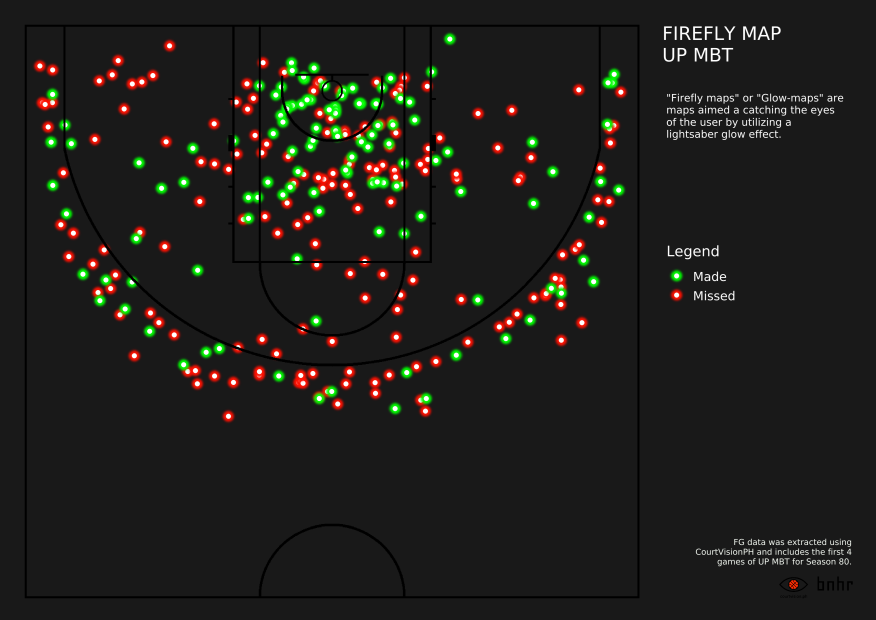
Last semester, I took up a Spatial Visualization course as part of my graduate studies. For my final project in class, I decided to create visualizations of shoting in basketball using GIS (mostly QGIS). Some of the visualizations that I created are shown below and include a shot chart, hot zones map, range map, firefly map, 2D binning, and 3D binning visualizations.


In this series of posts, I’d like to show how these visualizations are created while discussing cartography and styling in QGIS. The data needed to follow along with the posts can be found here.
It is recommended that you are already familiar with using basic symbology in QGIS such as single symbol, categorized, and graduated symbology to style your layers. You can check here for an introduction to symbology in QGIS.
The steps shown here are valid in both QGIS 2.18 and QGIS 3.0.
In this post, we’ll take a look at Rule-based symbology and how it can be used to create Shot-Charts.
Creating shot-charts using Rule-based symbology
Rule-based symbology renders styles based on simple SQL-style queries allowing you to style a layer based on multiple criteria. It extends the single symbol, categorized, and graduated symbologies so whatever you can do with those symbologies, you can also do with rule-based symbology and more.
For example, in this exercise we will create shot-charts using two layers: a raster image of the court (CourtMap.tif) and a point vector of the field-goal attempts for some games played by the UP Men’s Basketball Team (FGA.shp). We can actually create a simple shot chart with a categorized symbology using the made field in the FGA layer. This is similar to creating two rules – one for made shots (made = 1) and another for missed shots (made = 0). We can then extend these rules by adding other rules for shots taken by a team or shots taken by their opponents.
Add the Layer Styling Panel (optional)
Before we get into the nitty-gritty of making shot-charts, I’d like to introduce you to the Layer Styling Panel. Now, if you’re already familiar with it then you may skip this part but if this is your first time hearing about it then I think it could be your new best friend.
The Layer Styling Panel is a staple of my workflows and User Interface (UI) layout in QGIS. I usually dock it on the right side of the UI, opposite that of the Layers Panel. It allows you to select a layer and perform a “Live Update” of its style instead of the usual Right-click -> Properties -> Symbology -> Apply -> OK. This means that the changes you do in the Layer Styling Panel automatically gets reflected on the Map Canvas. It can also Undo or Redo style changes. It can save you countless clicks and minutes when using QGIS. If you’re not using it yet, I highly recommend you start doing so.
In order to activate the Layer Styling panel, go to View -> Panels -> Layer Styling.

Set a raster pixel as transparent (optional)
Sometimes, you want to set a raster pixel as transparent. In this case, we may want to set the white pixels in the CourtMap image as transparent.
To do this in QGIS, select the CourtMap raster in the Layer Styling Panel and go to the Transparency Tab. On the Transparency tab, add a new pixel in the Transparency Pixel list. Since we want the white pixels to be transparent and white pixels have an RGB of (255, 255, 255), we set the Red, Green, and Blue values to 255 and the Percent Transparency to 100.
Add rules for made and missed shots
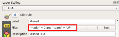
Let’s start by adding simple rules – one to style made shots and another to style missed shots. Select the FGA layer on the Layer Styling Panel and select Rule-based. Edit the existing rule (if there is any) by double-clicking it or clicking the Edit current rule button (Notepad sign at the bottom left of the Layer Panel). If a rule does not exist, you can add one by clicking the Add rule button (Plus sign).


For this exercise, let’s represent made shots as green circles (o), missed shots as red crosses (x).
For the made FGA, set the Label as Made and Filter to “made” = 1. Set the marker as a simple circular marker with green fill.


For the missed FGA, you can add a new rule or copy+paste the previous rule and edit it. Set the Label as Missed and Filter to “made” = 0. Set the marker as a simple cross marker with red outline and 0.4 mm stroke width.


Congratulations! You’ve successfullly created two rules that show a basic shot-chart of made and missed field-goal attempts in our data. Now let’s make things a bit more complicated.
Add rules to show a single team’s shot chart
The shot-chart we created above shows the field goal attemts by all teams. Now what if we want to show a shot chart of a single team (in this case, UP)? One way to do this is to edit the layer itself by applying a filter (Right-click on FGA layer -> Filter). However, you can also do this by using rules.
The first way is by adding the filter to the rules themselves. To do this, we edit the rules we previously created and add and “team” = ‘UP’ to their Filter.

The resulting map will only show the field goal attempts by UP.

Another way to do this is to create a first rule that filters using the team field and then add, under this rule, the Made and Missed rules that were previously created. Basically, we are creating two levels of rules – the first level to filter the team and the second to style the filtered data. In fact, using rule-based symbology, we can create as many levels of rules that we want.
For our current purpose, let’s create a rule labeled UP and set its Filter to “team” = ‘UP’. We will disable symbols for this rule so that it acts as a filter. Afterwards, we can add our Made and Missed rules to UP by copy+pasting or drag-and-dropping them inside the rule.


The results should then look like this:

Congratulations! You’ve created a multi-leveled rule that shows the shot-chart of UP. Let’s take this rule and extend it a bit more.
Add multiple sets of rules to show different shot charts
Using the multi-leveled rule you created, we can easily create shot-charts of other teams simply by editing the Filter of the top-level rule.
What if we want to create a shot-chart of UP’s opponents that we can view together with UP’s shot-chart? What we need to do is create another set of rules for this. However, since we already have the set of rules for UP, this will probably just take us around 20 seconds to do. Copy and Paste the existing UP rule, change the Label, and set the Filter to “team” != ‘UP’. The shot-chart of the UP’s opponents should appear in the Map Canvas.

Since we have two sets of rules, we can also style them separately. For example, we can use maroon for the color of UP’s shot-chart and gray for that of their opponents.

You can always add new sets of rules depending on what you want to show or focus on. For example, instead of a team, you can make rules for a player or set of players; you can make a rule where field-goal attempts during clutch situations (time remaining < 2 mins and game is within 5 points) have larger symbols so that they are easily identifiable; or a rule that gives different symbols to assisted and non-assisted three-pointers.
Final thoughts
Those are just some of the things that you can do with Rule-based symbology. It is a very powerful tool and learning how to properly utilize it is an investment in the right direction.
Stay tuned for the upcoming parts of this series where we’ll learn about firefly cartography, 2D and 3D binning methods, adding labels and legends to your maps, and other things. In my next post, we’ll take the shot-chart that we created here and turn it into a map that we can print as we dive into the QGIS Print Composer. See you then!
You may also like:
Towards a spatial analysis of shooting in Philippine basketball (FOSS4G2021)
Towards a spatial analysis of shooting in Philippine basketball (FOSS4G2021)
foss4g foss4gph qgis gis presentation
The opposite of free/libre and open source isn't commercial, it's proprietary
foss foss4g opensource freeasinfreedom freesoftware
Towards a Spatial Analysis of Philippine Basketball: Applications in the UAAP MBT (Season 81) [Part 1]
foss4g foss4gph thesis uaap mapping the geography of the uaap spatial analytics basketball basketball analytics
Win and let win: On being unconventional, openness, and building communities
foss4g foss4gph qgis gis presentation
